Contrast is simply defined as difference. Difference between art elements like color, value, size, texture, and so on can intensify the elements used. As a result, the elements used in a work of art can become more powerful. Although contrast is closely related with variety, it is usually considered a principle of art. Although some art purist, stick with variety and argue that contrast simply creates variety.

It is easy to understand how color can create contrast. For example, complementary colors provide a high level of contrast. Complementary colors are colors that are located directly across from each other on the color wheel. Red and green, blue and orange, and purple and yellow are all examples of this. But when using complementary colors, we also have to consider value. Value is the darkness or lightness of color. Without contrast in value, the contrast created by complementary colors is counter-productive.
Take this image for example...
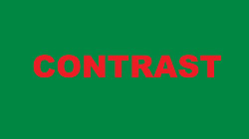
Notice how the red and green vibrate off of each other. The result is aesthetically horrid. The problem lies in the use of value. There needs to be contrast in value along with the contrast in color. If we change the values, not the colors, the result is more successful...